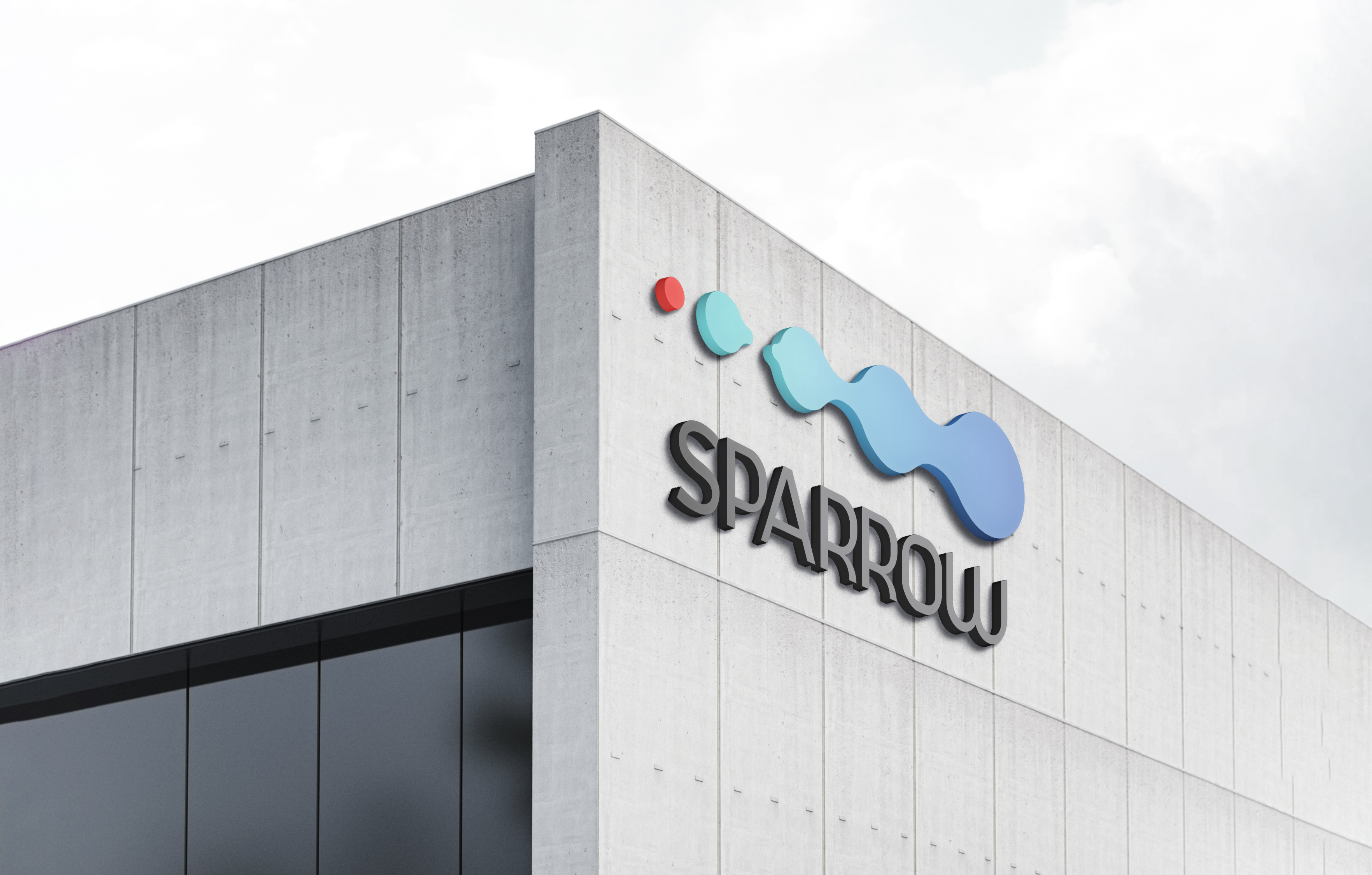
A new current in the city.
Client: SPARROW
Year: 2026
Sparrow is an urban development in Rasht positioned between two different expressions of the city: its historic social core and its more contemporary commercial life.
The challenge was to create an identity capable of connecting both; modern without becoming detached from its context, and distinctive enough to grow from a building into a recognizable urban destination.
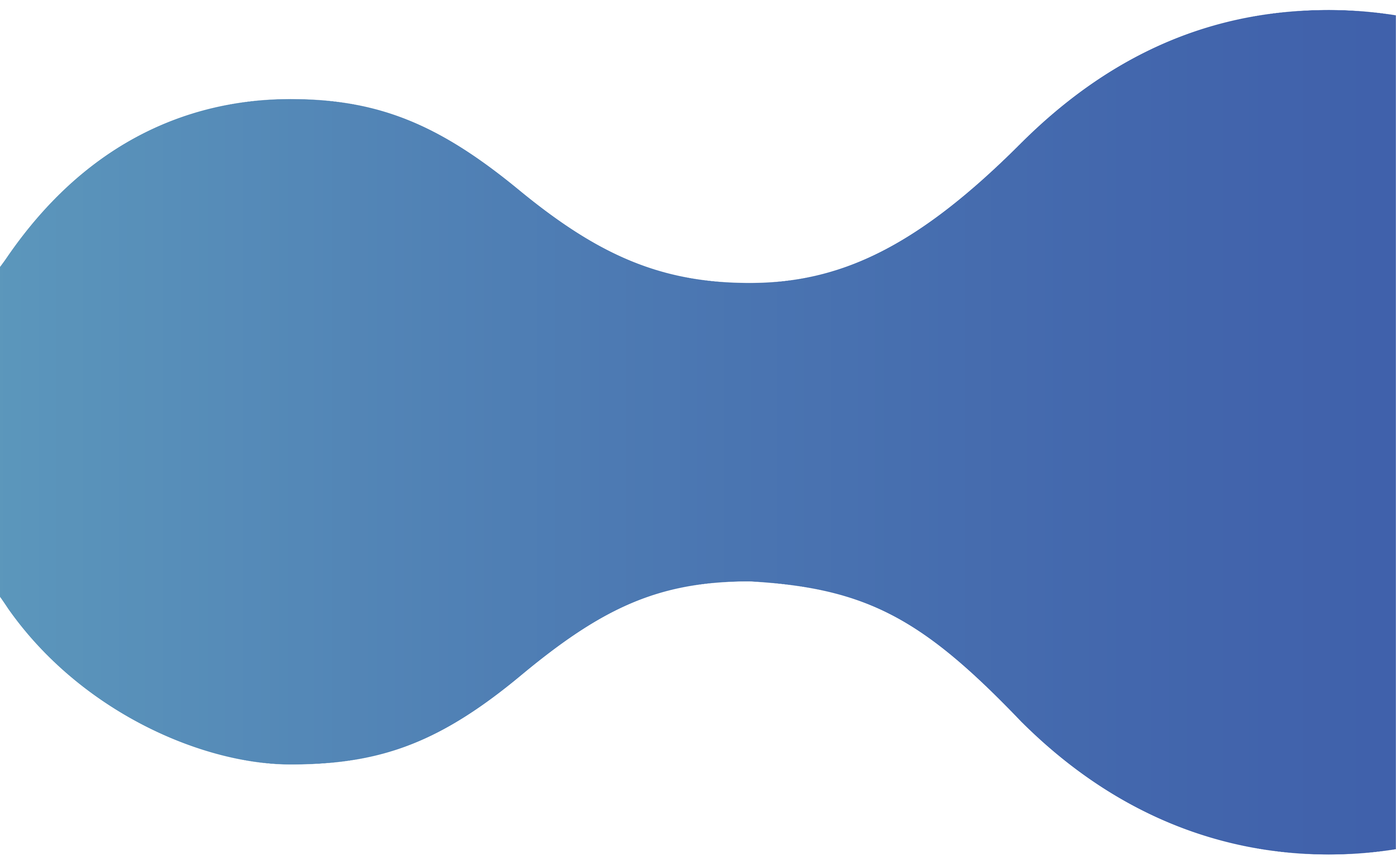
Light . Water . Movement
Sparrow is built around the idea of continuous movement; between people, places, experiences and the changing rhythm of the city.
Movement creates connection


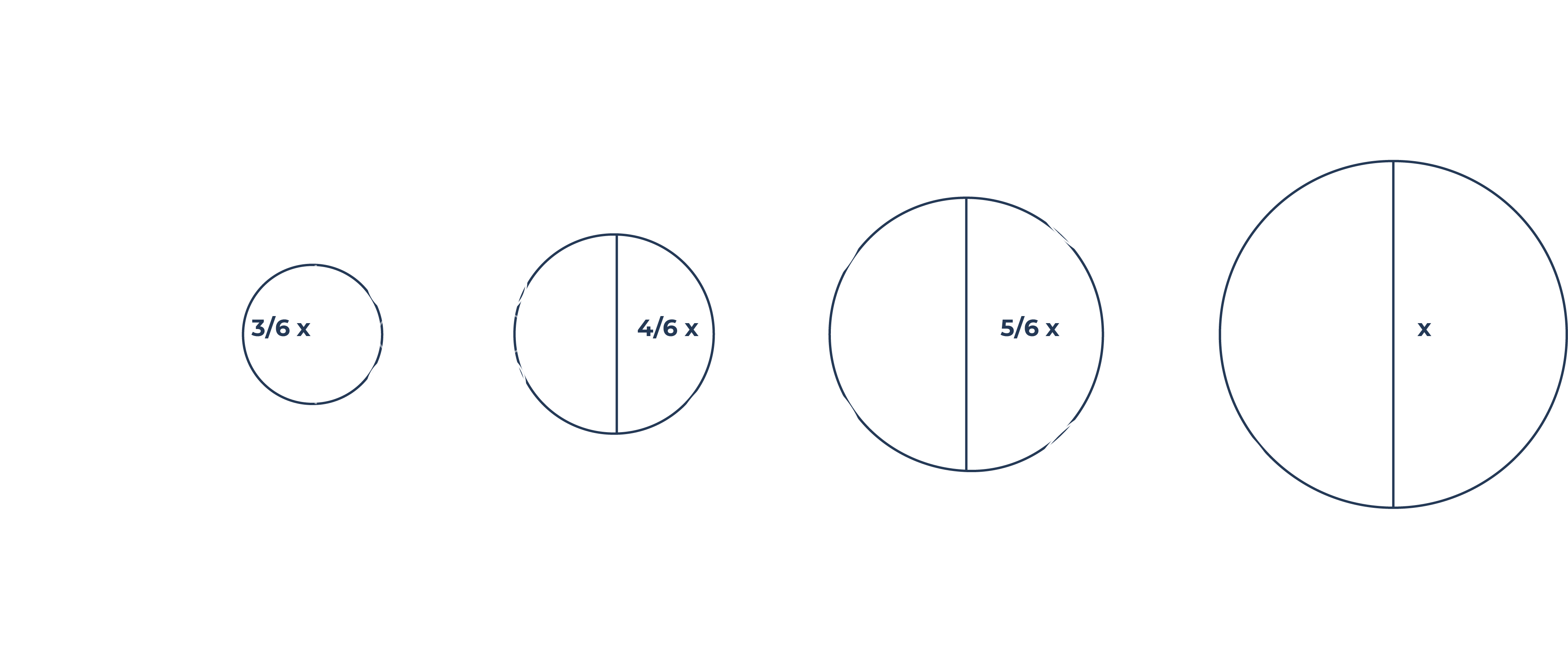
The symbol brings together two visual references: the shimmer of light across water and a contemporary interpretation of waves.
The result is a minimal form that feels fluid, rhythmic and constantly in motion.
Rather than describing Sparrow literally, the identity captures a behavior: movement.
The shifting forms suggest ripples, light and changing energy; giving the brand a visual language that can expand far beyond the logo itself.
Xona
#4061AB
Special Turquoise
#74C6CA
Shiny Red
#E8433C
Deluge
#746BAF
Mosaic Blue
#43BDD8
Citrusy Emerald
#53B78E
Lager
#F7C03E
Bright Copper
#ED6D53
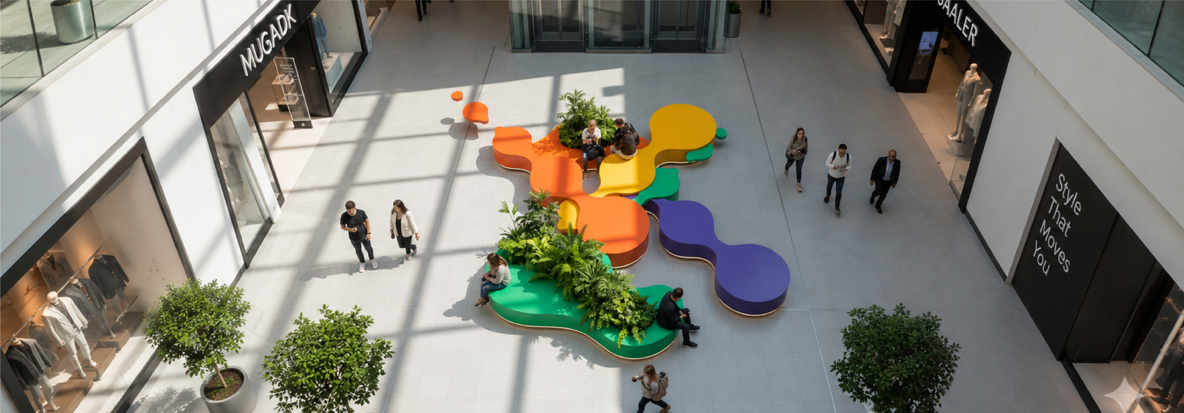
The color system moves between calm blues, bright accents and warmer tones.
Rather than relying on one dominant mood, the palette gives Sparrow enough range to speak across retail, culture, food, events and public experience.
Built to move
beyond the logo
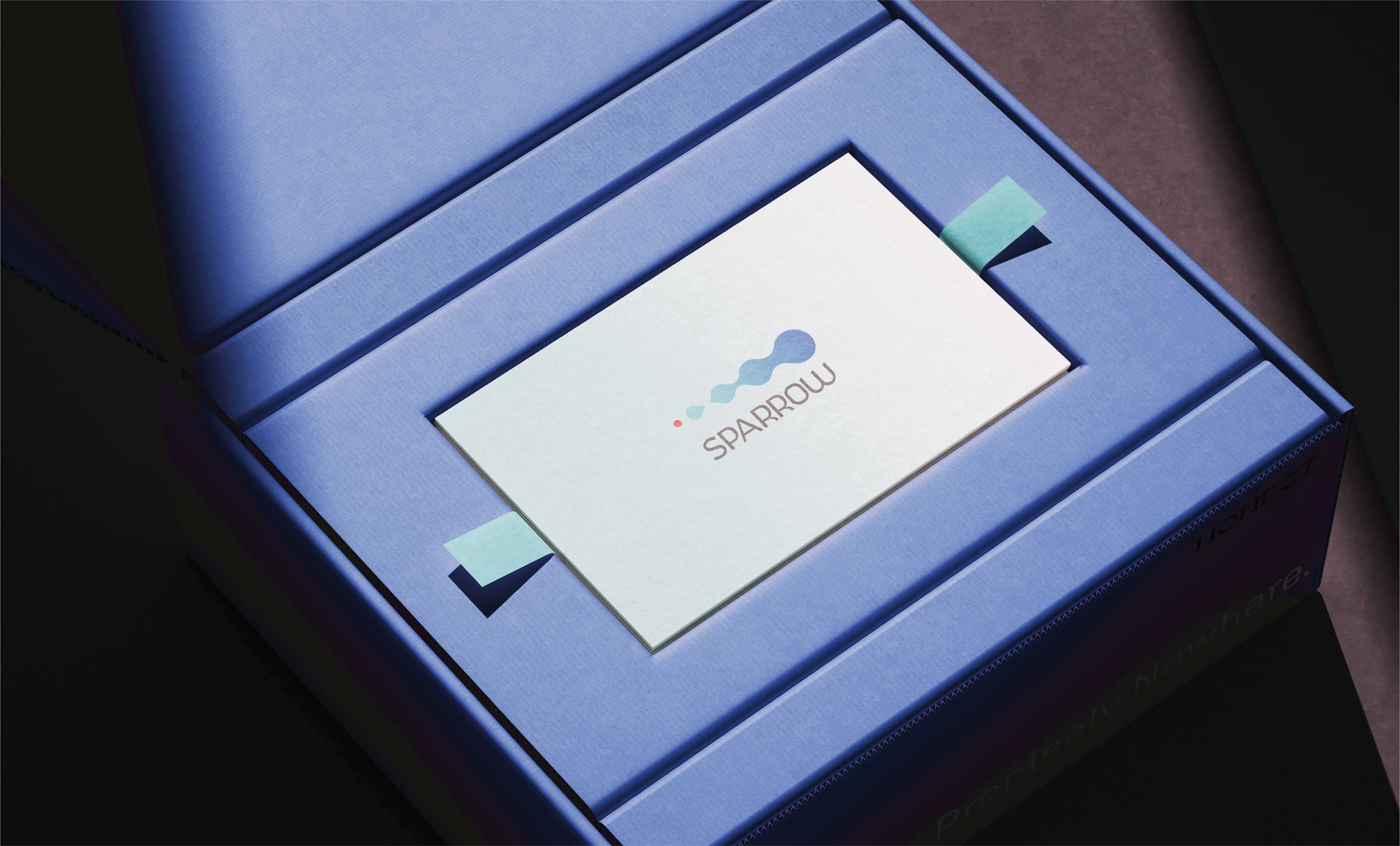
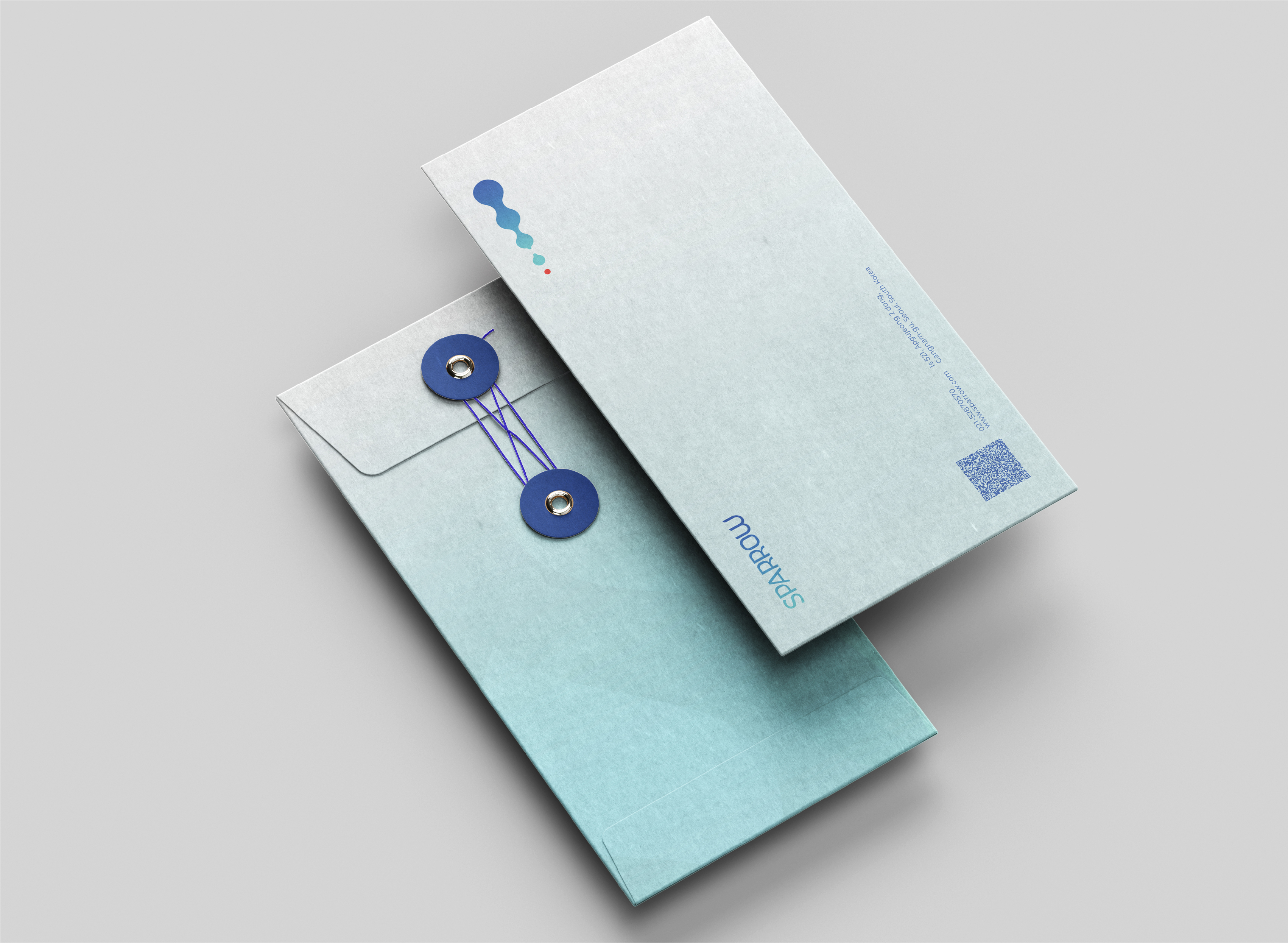
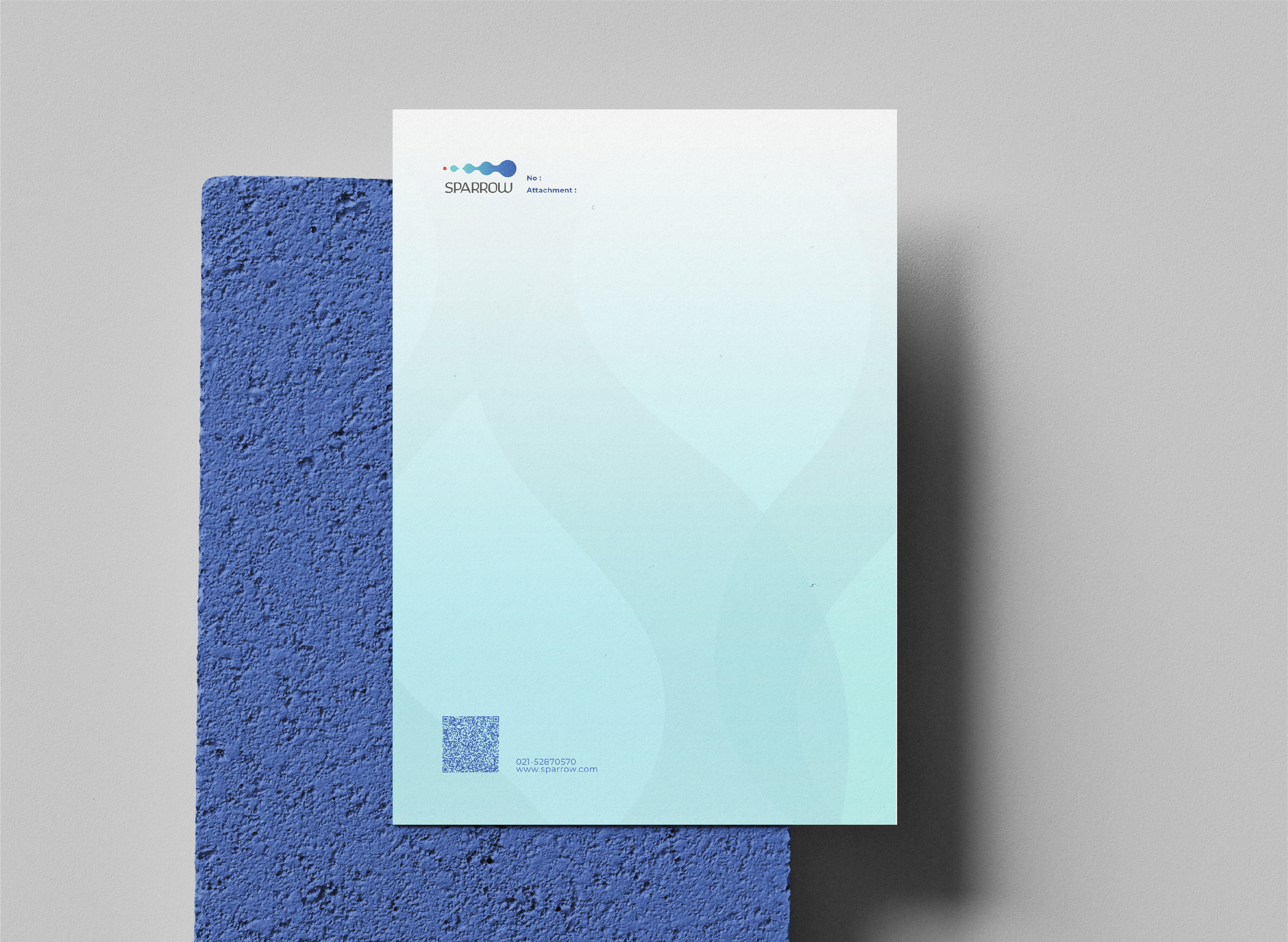
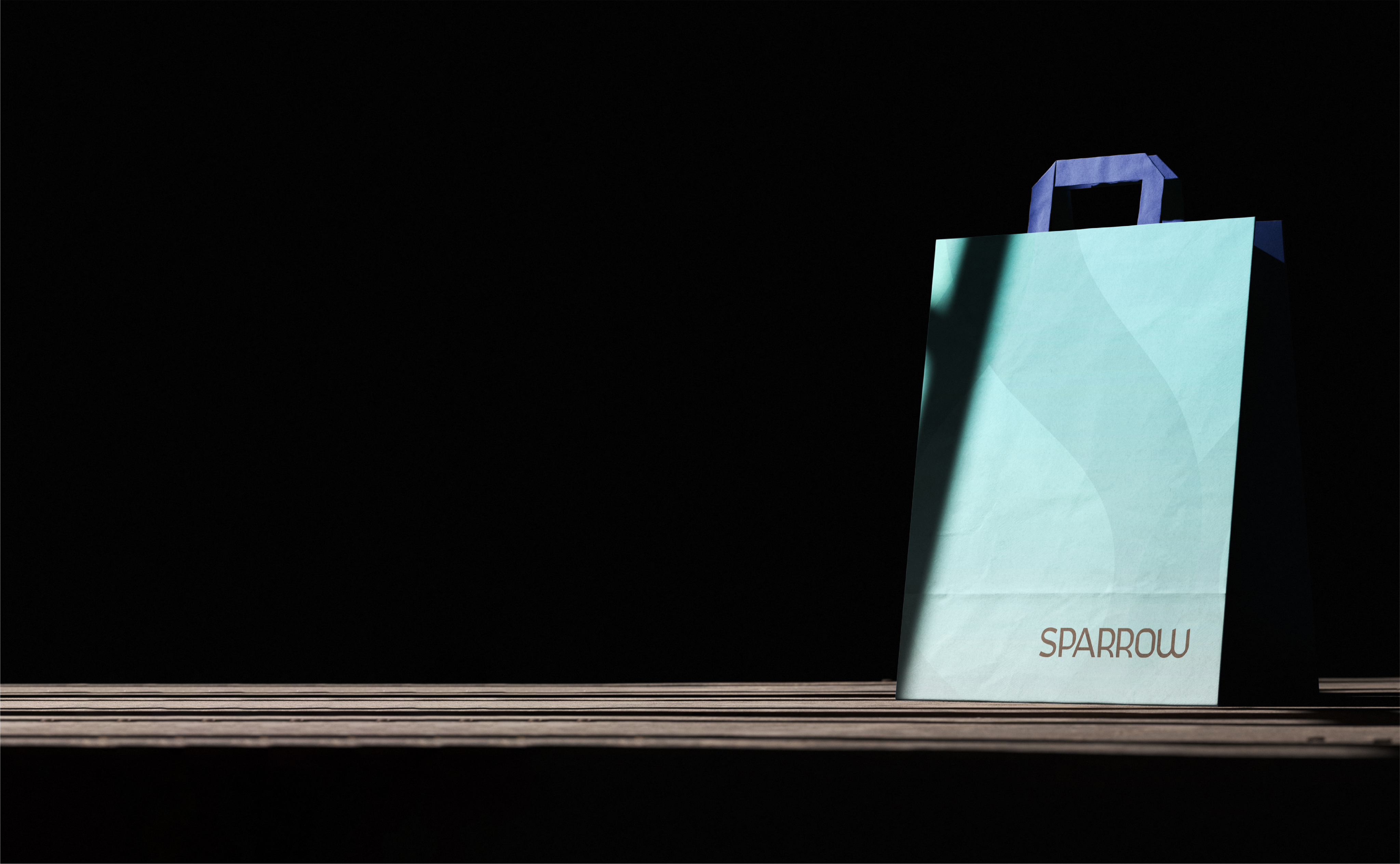
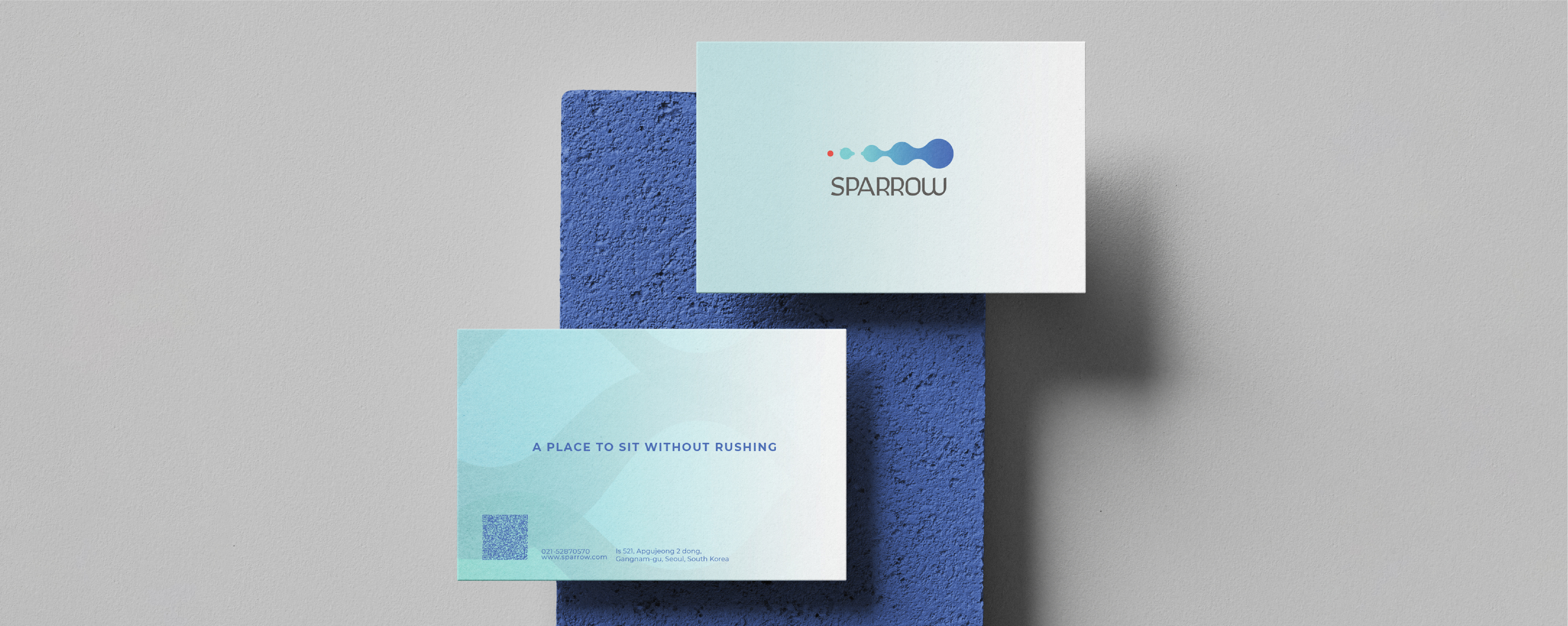
Across print, packaging, signage and communication, the identity adapts without losing its underlying rhythm.
The system is designed to remain recognizable while allowing each touchpoint to find its own expression.
The brand starts before the building opens
Sparrow’s identity creates the possibility of building recognition before completion; through cultural activations, temporary experiences and communication around the city.
Let's explore what your brand can become.
There's always another way to look at a brand. Let's find yours.
start a project