Client: Ventura
Year: 2022
Shift was conceived as more than a gaming venue: a multi-layered physical platform where play, hospitality, events, technology and community reinforce one another.
The challenge was to build a brand that feels engaging, accessible and cohesive across a constantly evolving mix of spaces, services and audiences.
brand idea
Shift turns entertainment into a reason to connect. Different activities, people and moments coexist within one experience; allowing friends, families, teams and communities to find their own way in.
logotype
The wordmark expresses motion without relying on obvious gaming language. Its directional forms and compressed rhythm create a sense of speed and momentum.
logomark
The symbol reduces the idea of "shift" to a simple act of displacement. Two offset forms create movement, tension and change; forming a mark that is instantly recognizable.
A PALETTE BEYOND GAMING

Muted green, deep berry and warm gold move Shift away from familiar gaming palettes. Together, they create a world that feels social, tactile and premium.
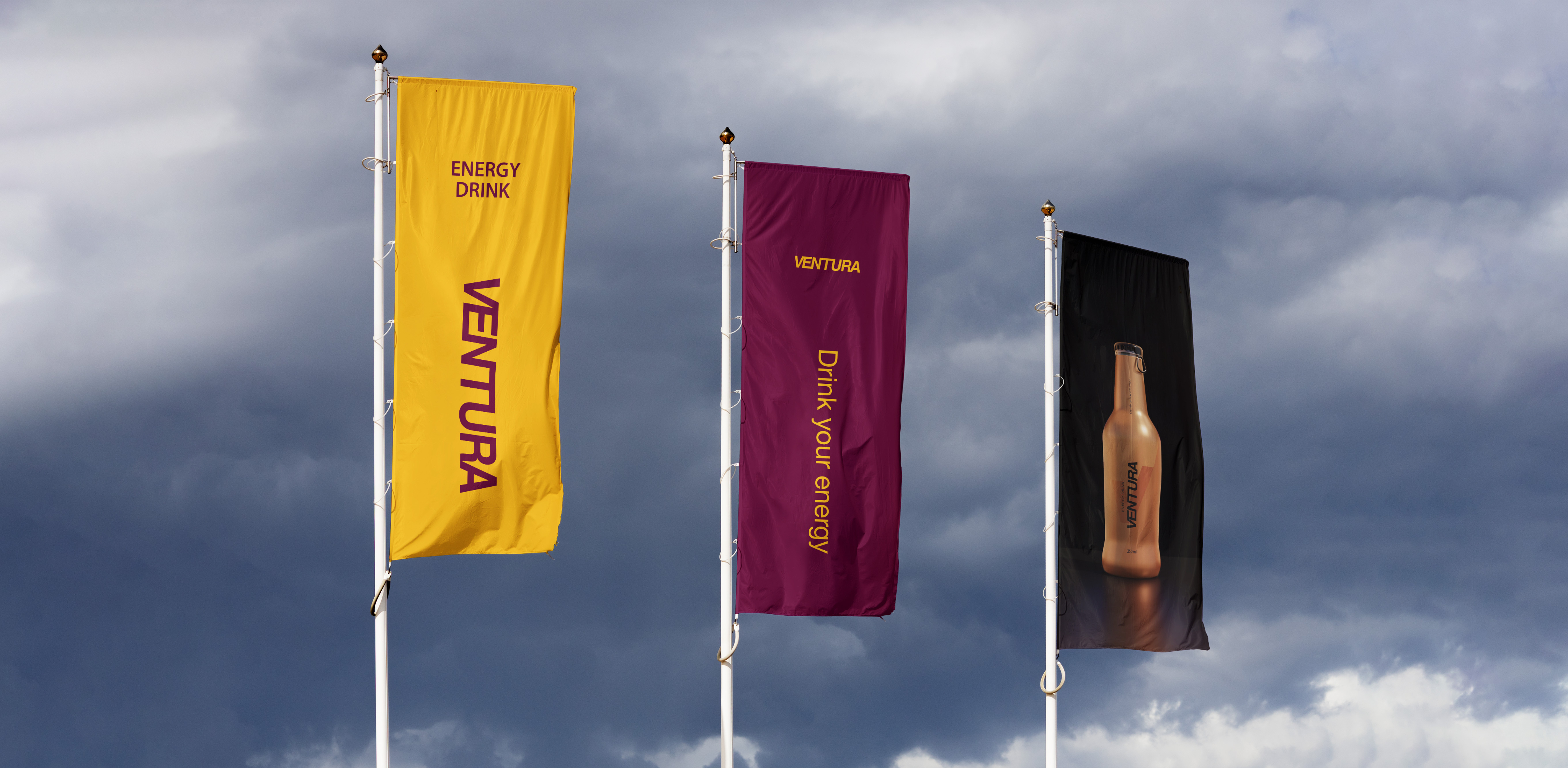
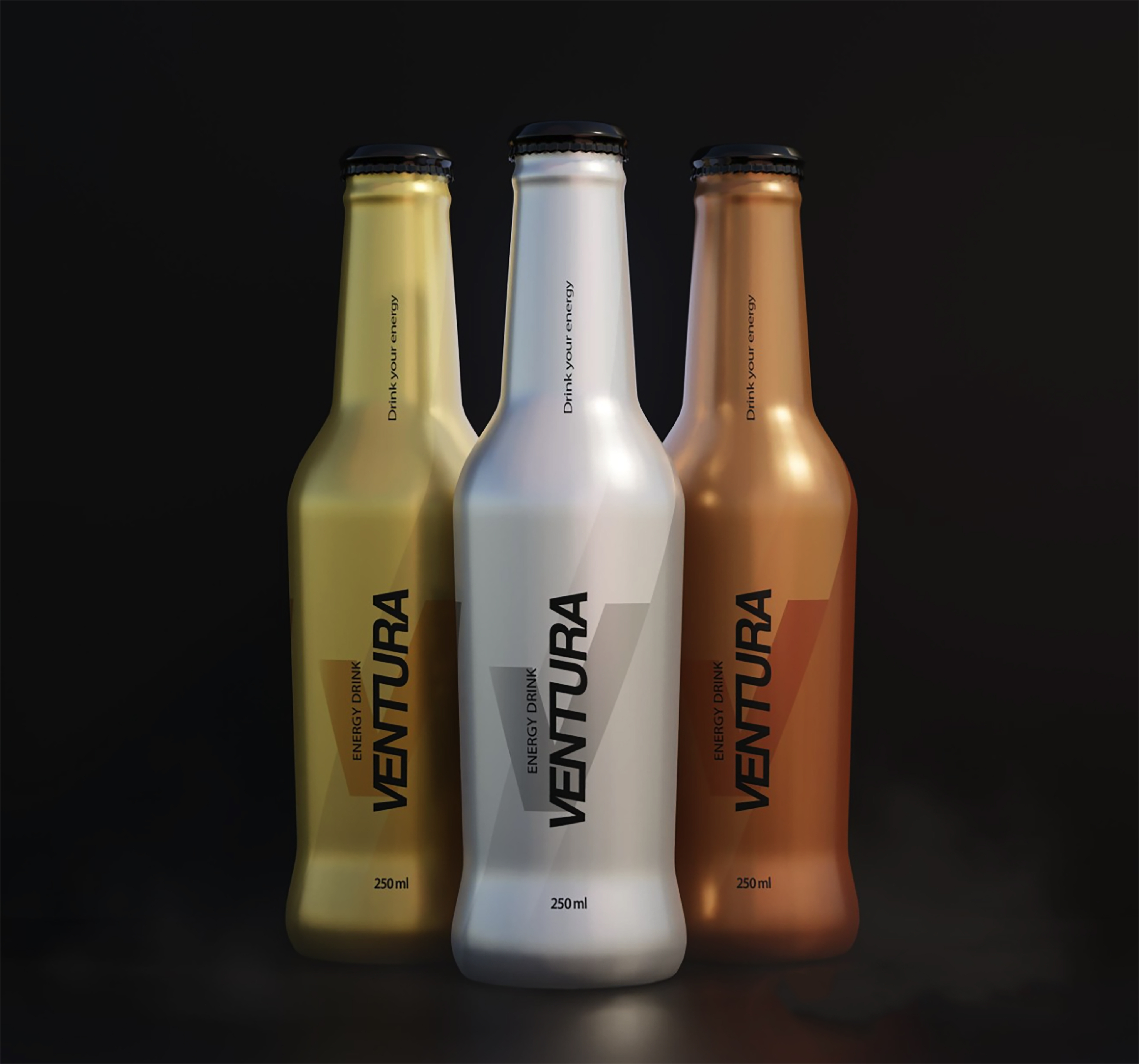
One identity, designed to hold an expanding world of play, people and possibilities together.
Let's explore what your brand can become.
There's always another way to look at a brand. Let's find yours.
start a project